Using the NCAA Tournament bracket to select college basketball’s best logo
The NCAA Tournament begins today. That means it’s time to sit back and enjoy some basketball like a normal human find new and creative ways to shoehorn March-Madness-related content down your throat.
Plenty of folks will pick teams based on skill, talent or coaching. Some may even use mascots or geography. But for me, this is the perfect time to find college basketball’s best logo. We’ll take the NCAA Tournament bracket and let the team with the best logo win. And just like the actual tournament, it will spit out results that are equal parts predictable and valid.
LET’S PICK SOME LOGOS!
South Region
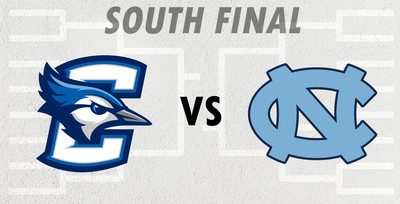
A region with some heavy hitters yields a final with a college basketball blue blood versus a true Cinderella. UNC’s rounded, interlocking logo is a classic. Distinctive enough to stand out but simple enough to be extremely versatile. It would work well in any color scheme, but the Carolina Blue makes it truly iconic.
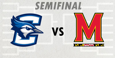
Creighton, meanwhile, takes a more modern approach. Combining a letter logo and an animal could become cluttered and busy, but somehow there’s works The accents on the C create a sense of motion that makes it distinctive without feeling unnecessary. And the blue jay may just be the best-rendered bird logo in sports. As much as I love that UNC logo, I gotta give this one to the Nebraskans (Creighton is in Nebraska, if you didn’t know).
WINNER: Creighton
West Region
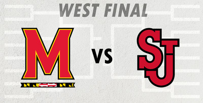
Two red logos remain, with the winner moving on to the Final Four. St John’s made it here on the strength of it’s simplicity, but also the clever incorporation of the smaller “t” in “St.” into the J. I’m a sucker for hidden elements (even if this one isn’t really hidden at all).
Maryland’s is driven heavily by the color scheme and pattern inspired by the Maryland state flag. The uniqueness makes it instantly recognizable. But they did a good job of incorporating the flag pattern without going overboard. If it were any more subtle, it would have a watermark.
WINNER: Maryland
Midwest Region
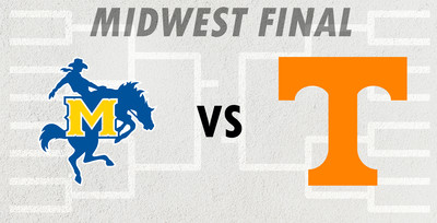
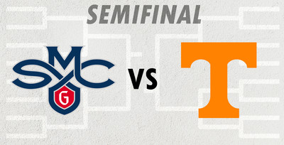
I don’t think we need to discuss much about the Tennessee logo. It’s clearly the cream of the crop of both T logos and orange logos. I can’t imagine anyone arguing otherwise. It’s called a Power T for a reason, because it’s memorable and versatile and is one of the best logos in college sports.
But let’s give McNeese it’s flowers. They used to just be a Wyoming ripoff, but they updated it (as mandated by the courts) to something even better. The cowboy conveys a great sense of motion, and the western “M” over the top pops with yellow. One of the better logo upgrades of the past decade. But as much as I love it, the Power of the Power T proves too much to overcome.
WINNER: Tennessee
East Region
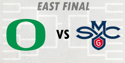
St. Mary’s is one of those schools you don’t hear much about outside of March Madness, but every time I see their logo, I’m reminded how much I adore it. It has a vintage feel but without feeling outdated, and perfectly conveys everything you’d want from a Catholic college’s athletic program.
Oregon. Well, it’s an O. So it shouldn’t be this great, but somehow it is. The simplicity and the color scheme has made it one of the best letter logos in college athletics. But is that enough to topple the mighty Gaels? No, no it is not.
WINNER: St. Mary’s.
Final Four
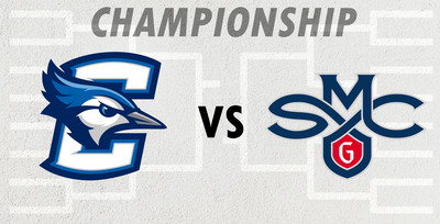
First of all, these two complement each other quite well. It’s a shame we won’t see them on the court together this season (because let’s be honest, neither of these teams are getting this far). But if I have to pick a winner, I can’t get past how good that Blue Jay looks. The shape and the shading are simply elite.
WINNER: Creighton
Power T Schmower T. They’re UT and they’re orange, so screw those guys. GAELS MOVE ON TO THE ‘SHIP!
WINNER: St. Mary’s
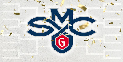
These two schools could not be more different. One is a small Roman Catholic private school, the other is a slightly less small Catholic private school. One’s color scheme featured dark blue. The other features a virtually indistinguishable but still technically different shade of dark blue.
But seriously, Creighton and St. Mary’s have some absolutely beautiful marks. So really, they’re both winners. But actually St. Mary’s in the winner.
All Tournament Team (aka, just some other logos I like)